Brand & Press Kit
The wordmark, monogram, colors, type, and social artwork of The LA Globe — every file ready to download, with the short list of rules that keep the paper looking like itself.
01The Wordmark
The LG globe mark, a hairline rule, THE LA GLOBE in a Didone serif, and the line beneath it: TRUSTED. INDEPENDENT. UNBIASED. One piece — never split it.

- wordmark-black-transparent.png Ink wordmark, transparent ground 1485 × 194 Download
- wordmark-white-transparent.png White wordmark, transparent ground 1485 × 194 Download
- wordmark-on-white.png Ink wordmark, flattened onto white 1561 × 270 Download
- wordmark-on-black.png White wordmark, flattened onto near-black 1561 × 270 Download




02Monogram
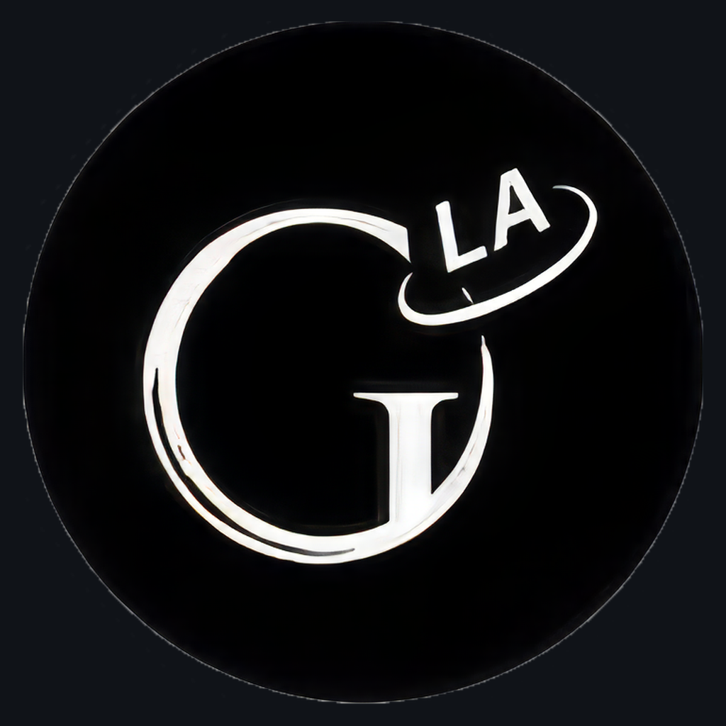
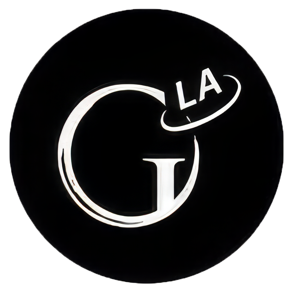
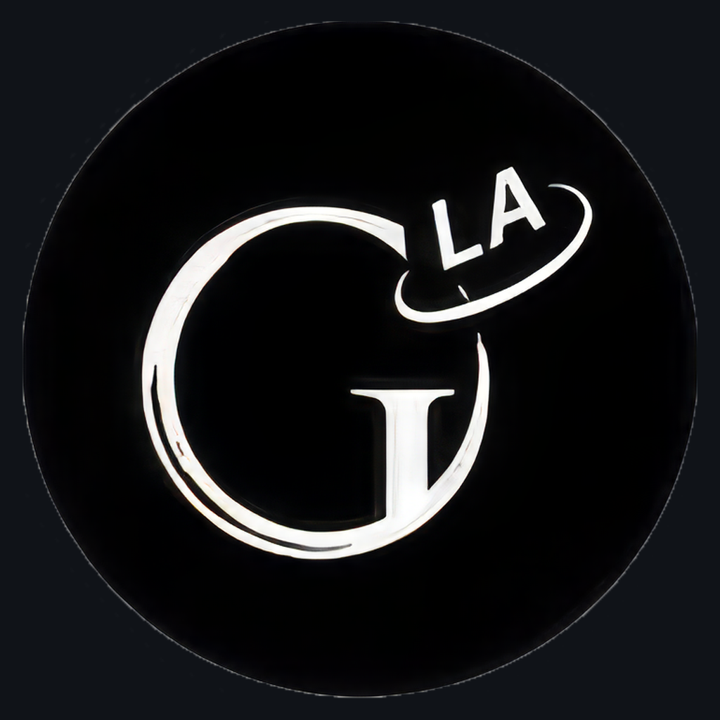
The LG mark — the L and G with the globe set into the G — standing alone.Use the monogram where the full wordmark would be unreadable: profile photos, avatars, app icons, and favicons. Give it a square of its own and let the globe breathe — don't crop into it.
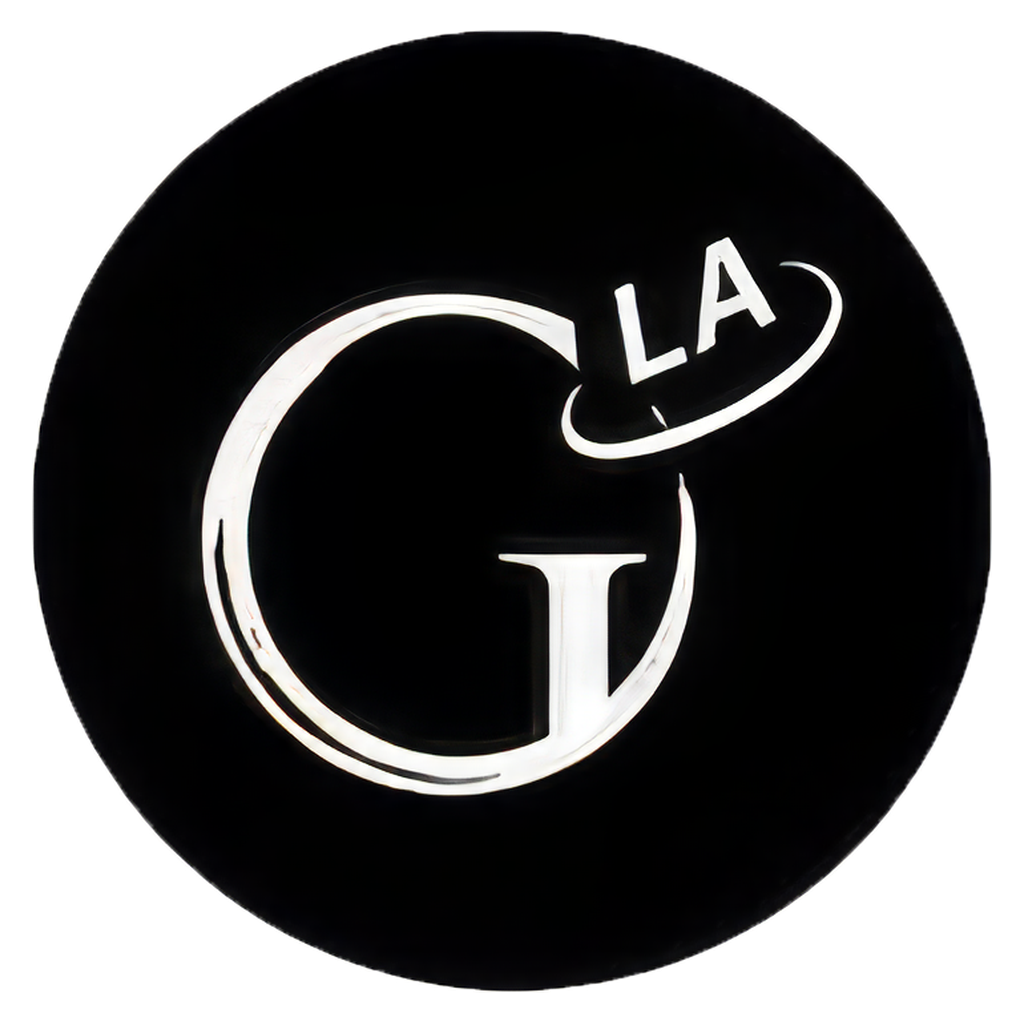
- icon-1024-on-white.png Square avatar, light ground 1024 × 1024 Download
- icon-1024-on-black.png Square avatar, dark ground 1024 × 1024 Download
- icon-1024-transparent.png Square avatar, transparent ground 1024 × 1024 Download
- monogram-transparent.png Mark only, cropped tight, transparent ground 976 × 787 Download
03Color
Ink on near-white paper, one royal blue for accent. Click a swatch to copy its hex.04Typography
Three faces, three jobs. A Didone for display, a serif for reading, a grotesque for labels.500 · 600 · 700
Tight tracking, balanced wraps.
Variable, 200–900, optical sizing on.
17px / 1.6 on screen.
The LA Globe covers Los Angeles news, food, transit, and culture — sharp digests of the city's essential stories, plus original columns.
Set at a comfortable measure, this is the face that carries the reading. It holds its color at small sizes and keeps its footing in italic.
400 · 500 · 600 · 700
Letterspaced 0.11–0.15em.
Inter is never used for headlines or body copy. It exists to label things — kickers, section names, metadata, buttons — always uppercase, always letterspaced, usually in ink or the royal blue.
06Using the Marks
Six rules. They are mostly about leaving the mark alone.
-
Do
Give it room. Clear space on every side equals the height of the O. More is always fine; less is not.
-
Do
Match the lockup to the ground. Ink on light, white on dark. Scale proportionally from the supplied files — they're large enough for print.
-
Don't
Recolor it. The lockup is ink (#121417) or white, nothing else; the royal blue (#2447E0) belongs to rules and links, not to the mark. No other combination is the wordmark.
-
Don't
Stretch, squash, rotate, or decorate. No outlines, drop shadows, glows, or gradients. Keep the original proportions.
-
Don't
Set it on busy photography. The globe's meridians disappear against detail. Use a quiet area of the image, or a solid panel.
-
Don't
Rebuild the wordmark in another font. Playfair Display is the site's display face, not the logo. Always use the supplied files.
07Contact
Questions about these files, or about using the marks.THE LA GLOBE™ — the name, wordmark, and LG globe mark are claimed as trademarks of this publication. Assets on this page are provided for editorial and press use; do not use them to imply affiliation or endorsement.
Write to editor@thelaglobe.com — Robert Guicheteau, Editor. If you need a size or format that isn't here, ask.
The Front Page
05Social & Sharing
Pre-sized artwork for profile headers, posts, stories, and link previews.